.:[Double Click To][Close]:.
Showing posts with label Designers. Show all posts

Friday, February 25, 2011

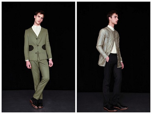
Showroom Next Door AW11: Mohsin Ali


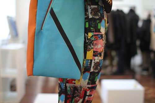
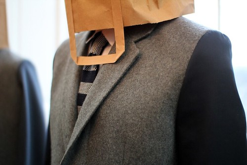
As introduced last week, Mohsin Ali launched his eponymous line for AW11 at the Showroom Next Door. Having enthused over his sleek look book before my visit, my excitement grew further after I was afforded the opportunity to inspect his designs up close. For us, the real beauty of menswear is in the details and this collection has a cacophony of them. Having been inspired by twenty first century explorers, Ali has obsessed over the concept of integration and layering to create multi faceted items. From built in thumb pieces to quilted linings, this is a collection that celebrates the true beauty of menswear.

Since graduating from the LCF with a First Class honours degree in 1999, Mohsin Ali has carved a career that has seen him design and develop product for a variety of brands across the globe. He might have spent the last decade under the radar, learning his trade and refining his aesthetic but now is Ali's time to step in to the spotlight with a remarkably accomplished debut offering. For this exciting talent, design should be questioned and challenged at all times and only then can you produce and create something truly special. All appliance should be for a reason. Throughout his debut collection, Ali showcases a real love for both traditional and technical fabrics mixing both in his collections as well as his fascination with cut and silhouette. Here, we take a closer look at the collection and talk to the designer about launching his own label and following the rules of form, fabric and function.

----------
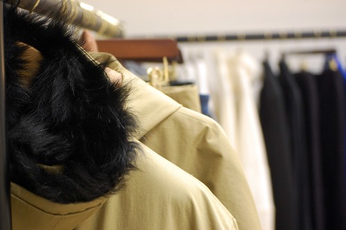
The enticing two rails of product at the Showroom Next Door.

SS: You graduated from LCF with a first class honours degree back in 1999. Having resisted the temptation to set up your own label up until now, what have you been up to?
Mohsin: It is so, so difficult to launch your own line at that age. Also, my background is a bit different from most. When I was seventeen I was buying Comme des Garcons for a shop in Leeds and I've been around labels since a young age, I understand really nice, beautiful product. After I graduated I decided that I wanted to consult and work on a freelance basis. I was soon involved in all aspects of the industry, from problem solving to designing to manufacturing. All were key elements to what I do now.

SS: What were your inspirations, your dreams and the driving catalyst behind launching your own label?
Mohsin Ali: This is just where I want to be. I love menswear. I understand it from a retail perspective as well as a design one and now just felt the right time. There is an interest and has been a real lift in menswear but there was a gap in the market for what I wanted to offer. I'm in an environment here where I want to put on a pair of Mr Hare sheepskin lined boots with my outwear trousers and a coat. This is sophisticated menswear.

SS: What was the starting point for the collection?
Mohsin Ali: The collection is actually based around the concept of twenty first century explorers. I was drawn to idea that your initial skin has to be the warmest and therefore the importance of layering and thermals. The collection is built around these ideas which is why some of the garments have built in thumb pieces, others have sheepskin liners, quilting and detachable liners. Additionally, I was intrigued by the idea that the less you carry the easier it is to travel. My interpretation of this was to apply less and integrate more. Everything is integral. Piece by piece, everything is cut in and we've done through the shirting, trousers and outerwear so everything is flat and streamlined.

SS: For us, menswear is all about the details and this collection has them in an abundance...
Mohsin Ali: Exactly. To the naked eye a product can be simple only when you analyse and look closely do you see the really beauty, the real greatness. This is what interests me most about design.

SS: The label lives by three main rules; form, fabric and function...
Mohsin Ali: Exactly, it is all about shape, detail and fabric. Sometimes People can question your work when it is a simple product because there is little appliance to distract. Your shape, detailing and finish all have to be right. There is nowhere to hide with this type of design. Everything has to be there for a reason.

SS: Throughout each piece you've experimented with shape and fabric. Could you talk us through the silhouette and your love of fabric.
Mohsin Ali: I've always loved the interplay between narrow and oversized garments. The shapes come from there really. I wanted to keep it simple and actually once you break it down the shapes are simple but I've experiment with fabric.

I do love great fabric. If I had my way, I would source them all from here but unfortunately it is not possible. A lot of the wools are from here and Italy, the more technical fabrics come from Italy and all of my jerseys come from a mill in Yorkshire.

SS: Local manufacture is an important facet of the label. How difficult was it to produce the collection here in the UK?
Mohsin Ali: The first challenge is that I want to continue English manufacturing, the industry is here and I want to use it for as long a possible. It was great working with the factories for this collection, some of the elements of the collection were fine and others were more difficult. Throughout the collection, I wanted to explore cut and a number of the pieces are technically difficult. We are in a manufacturing age in the UK where a number of the factories do not offer laser cutting facilities, here it is all done by hand. More costly but the results are fantastic.

SS: Who is the Mohsin Ali man? How would you like to see men buy the collection?
Mohsin Ali: Ideally, I would like men to buy it piece by piece to build a collection. I'm hoping that it becomes a product that is timeless that could be worn for years and years. I'd like to walk in to a store and see it alongside the likes of Raf and Jil Sander because those are the brands I love but I would like people to come in just for my designs. Ultimately, I want people to appreciate it. For stores to pick it up and for people to buy it and wear it.

SS: How has the reaction been to your collection?
Mohsin Ali: It has been great. So many people have remarked that it doesn't look like a first collection and it shouldn't do. I'm thirty five years old and I've worked in the industry for a number of years but still, I'm pleased with the finish of this collection.

SS: This is the eve of Menswear Day at LFW, moving forward a season two down the line, would you like to show as part of the day?
Mohsin Ali: At the moment, I'd rather create an amazing installation rather than a catwalk show. When you are younger, all you want to do is show on a catwalk but now, I've got amazing ideas for installations. There are artists who I would love to bring in and I've begun to think about how I would love to display the pieces.

SS: Finally, what would you like to achieve in 2011?
Mohsin Ali: I want to make it even more sophisticated next season. For SS12, I've been inspired by Zaha Hadid, both in terms of her architecture and her philosophy to design. I'm already excited.
----------

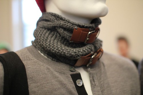
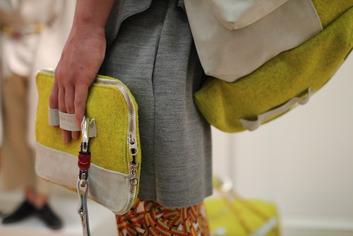
The format of the Showroom Next Door allowed me to inspect, touch and marvel and each piece. Ali's approach might appear simple at first glance but it is multifaceted and detail rich. Below are just a few of the details that caught my eye...
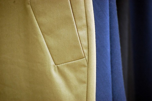

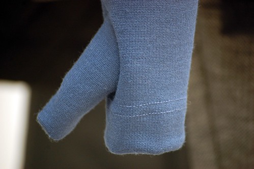
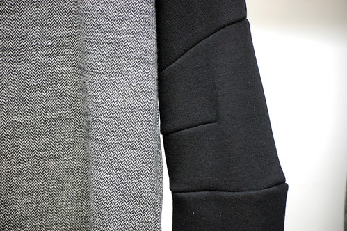
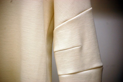
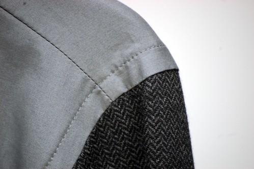
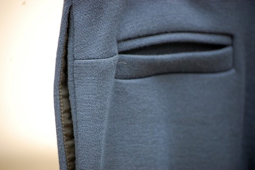
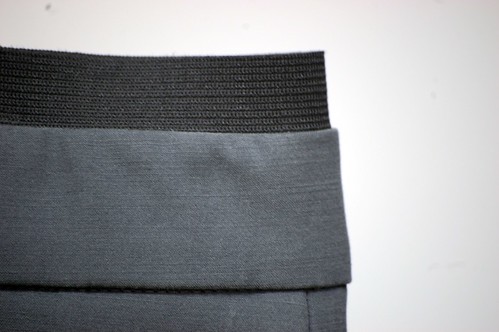


"To the naked eye a product can be simple, only when you analyse and look closely do you see the really beauty"

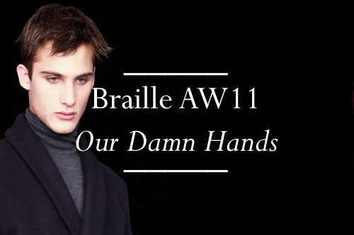
Braille AW11 Our Damn Hands


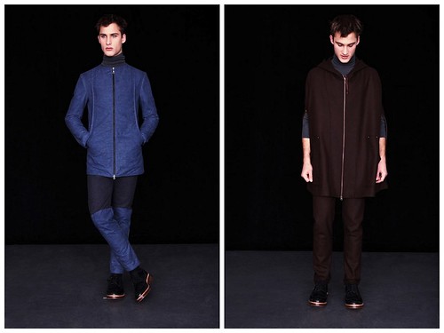
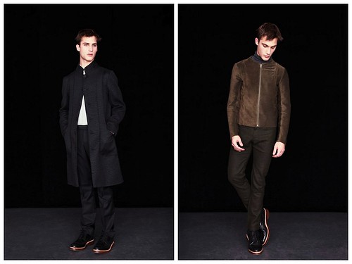
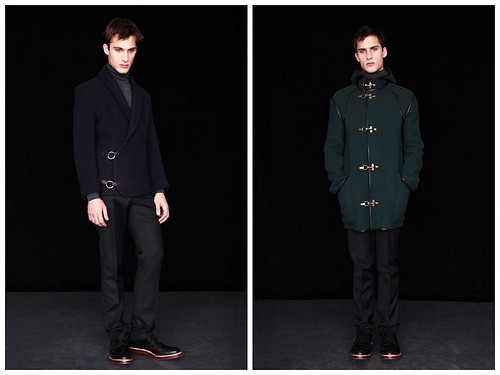
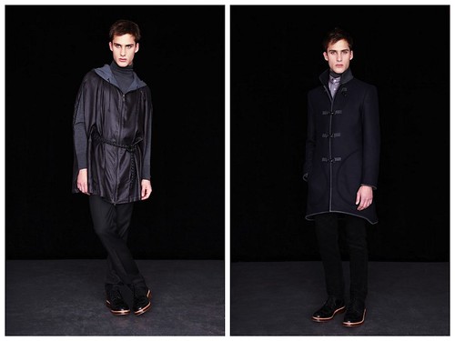
Braille burst on to the scene at Vauxhall Fashion Scout back in February of last year and they've since gone from strength to strength and deservedly so. The London based design duo, Benjamin Vorono and Samuel Kientsch, are able to design garments that can effortlessly slide in to any man's wardrobe.  In just twelve months, the pair have carved a covetable reputation for creating reimagined wardrobe staples that have a strong but delicate touch. The discovery of the label was one of the real blogging highlights of the year and we've kept a close eye on their development ever since. To mark the launch of their third collection, Our Damn Hands, we catch up with one half of the design duo to learn more about the collection before excitedly sharing a preview of their video look.
----------


SS: What was the initial starting point for the collection?
Samuel Kientsch: We were initially drawn to imagery from Detroit and New Orleans, a certain beauty in the decomposition of these historically important cities. In our minds these places are ripe for entrepreneurialism, this enthusiasm is at the heart of Our Damn Hands.

SS: During Fashion 156's insightful Designer Track series I read that you took inspiration from a road trip around the UK. How did the British countryside inspire the collection?
Samuel Kientsch: Nature offers a real sense of freedom it allows the creativity that we have been kicking around in the city to blossom and come to life. After getting out of town it becomes much easier to understand the collection we've have been dreaming about. In more straightforward terms the colour palette, especially the celadon and slate are a direct reference to the environment we encountered on our walks.


SS: British Fabrics and manufacture are a fundamental facet of the label and I know that you've searched for the craftsmen to help make your designs a reality. What does Made in England mean to you?
Samuel Kientsch: We think it's unfortunate that manufacturing has been economically forced out of the United Kingdom. A factory that we are currently using is in real danger of going out of business and if this continues to happen 'Made in England' will only carry a greater premium. We don't champion 'Made in England' because we feel the quality is necessarily better but rather it is simply about supporting the community. There are enough designers in London and we feel the production side should be better served. Long-term opening our own factory is definitely a goal but only if the government is serious about creating jobs. Funding is desperately needed for small businesses of all kinds.


SS: The collection showcases a wonderful sense of texture. The fabric combinations in the outerwear are particularly stunning. Could you talk us through a few of your favourites?
Samuel Kientsch: The Reversible Bomber uses suede and wool, the suede is elegant and the wool more utilitarian, we used cording to add texture and to emphasize the masculine shape. The Duffle Coat has gotten the best reaction so far. When you pick it up you can sense from its weight that it is going to keep you nice and warm, we used leather binding as a bridge between the softness of the wool and the hardness of the fireman's clips.


SS: In only three seasons, you've managed to forge a clear design signature but how would you describe it?
Samuel Kientsch: We have always strived to have a real balance between strong and delicate in each individual garment. It's important that our clothes are inherently masculine but genteel details go a long way.

SS: What would you like to see Braille achieve in 2011?
Samuel Kientsch: This year is all about stabilising our business, it was really great to begin selling right at the start but it was also overwhelming at times. Our Damn Hands is a direct reference to the fact that this collection was completed up to the sampling stage with minimal assistance from interns or pattern cutters. It was a great learning experience but definitely not how we will operate in the future. Come Spring/Summer 2012 we will be in a good position to start selling to the international boutiques we have had our eyes on since the beginning.

----------

As with the two previous collections, Our Damn Hands is driven by textile. Here, Braille once again showcase a heady mix of breathtaking fabrics. Textural highlights include a waxed belted silk poncho, a textured wool pocket overcoat and a suede reversible corded bomber. To help showcase the collection to the full, the duo set sent through their motion look book for your viewing pleasure...

Menswear Day AW11: A Few Highlights


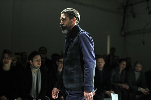
Exactly twenty four hours ago I was curled up on the sofa in a foetal position slowly rocking and talking gibberish to myself about designers, collections and future post features. This blogger was overcome by the menswear sights seen and indeed unseen during an extremely hectic and action packed Menswear Day. It was a fitting culmination of an eventful fashion week. The entire schedule helped cause a sartorial stir or two whilst collectively flying the flag of menswear and tiring me out in the process. Now...where do I begin?

Over the last few seasons Menswear Day has continued to grow and in all honesty, it is close to outgrowing itself. Once again presentations, catwalk shows and film screenings all celebrated the exciting diversity of menswear design talent which uniquely exists in this capital of ours. As always it has been hugely exciting to see stalwarts of Savile Row sit so comfortably alongside high street regulars, established designers and enthralling new talent alike. However, as the talent grows the schedule gets that bit tighter and more frantic. Yesterday was a crazy day. But it was also a great day. 

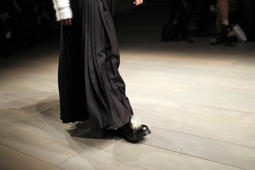
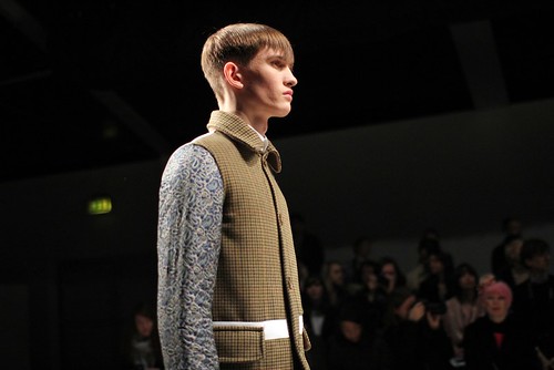
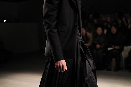
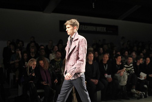
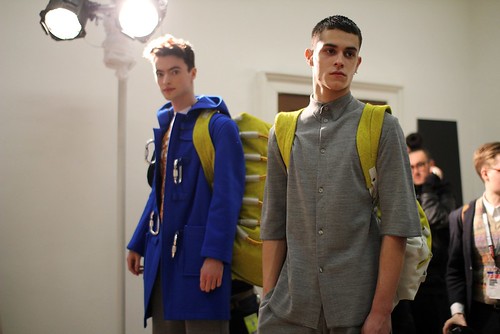
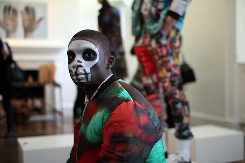
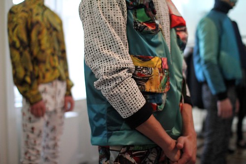
There were so many highlights and there just is far too much to say in one post.  From JW Anderson carving out a more luxurious aesthetic and somehow still managing to pull of sherbet leather trousers  to E. Tautz elegant sportswear and James Long's mayhem of texture to Matthew Miller's functional wardrobe for the contemporary man to Omar Kashoura's toy solider inspired tailoring. The day had it all and more. So, over the course of the coming weeks, the blog will periodically shine the informed spotlight on the deserved many who brought a gasp, a swoon and even the odd smile. To get the blogging ball rolling I would like to treat you to a plethora of captured moments that left the greatest impression... 


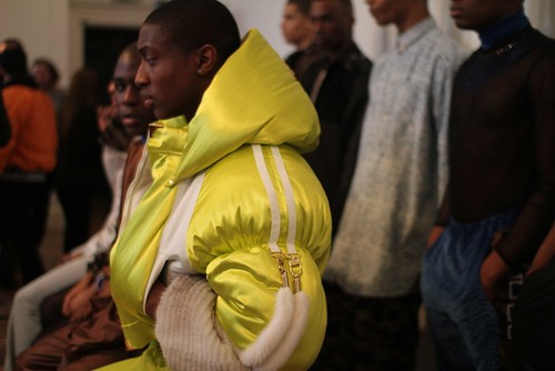
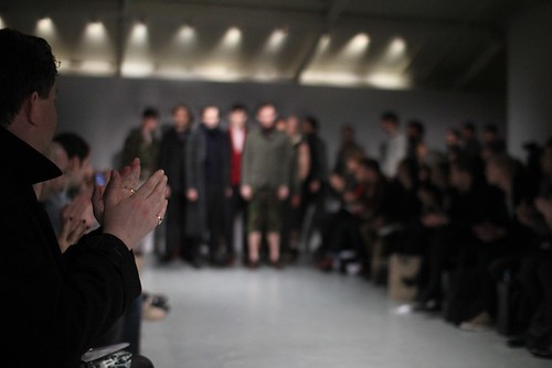
I hope my imagery helps demonstrate the diversity of menswear talent that we are treated to in the capital during this special day. The day might have flashed right by my excited eyes but these moments (in addition to many not photographed) confirmed how far Menswear Day has come. If this has whet your appetite for more detail about the day, prepare for more meatier posts in the coming week.

Menswear Installations AW11: Baartmans and Siegel


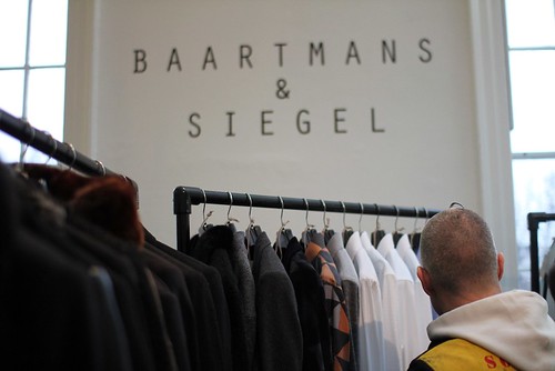
For me, nothing represents the diversity of menswear design talent quite like the NEWGEN MEN and Fashion East Menswear installations. I excitedly bounced from room to room in the wings of Somerset House uncovering the beautiful alongside the wonderful and even the unusual, it was discovery at every turn. I did however encounter a few familiar faces and designs. One of the most welcome sights was Baartmans & Siegel's strong presence in a room of much design delight.

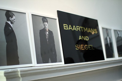
Last month I was treated to a full preview of Baartmans & Siegel's AW11 collection, Deckard. Here, the design duo evolved their offering by developing these signatures even further and have introduced new covetable threads such as the interspersion of draped, soft, rounded tailoring amongst the sharp cuts and have experimented with even more tactile fabrications that provoke endless stroking and much luxurious comfort. Functional items that effortlessly combine luxury with a sense of protection throughout. This is performance lux and it was great to see it alongside the likes of Agi & Sam, Marwood and company.


Self described as modern-traditionalists, Wouter Baartmans and Amber Siegel’s work focuses on beautiful fabrics that seduce, and shapes that are accessible yet distinctive. Once again, fabric is key for AW11. Here the collection predominantly uses a variety of silks, wools, linens and mohairs and I didn't need an excuse to stroke them once again. I certainly won't grow tired of seeing this collection and long to have the odd item hanging in my wardrobe. As previously discussed,  Deckard takes its inspiration from the 1982 science fiction film Blade Runner and the futuristic noir-scape it details. However, rather than an obvious homage to the dystopian urban characters and scenes created by Ridley Scott, the pair looked deeper and picked out key themes to create pieces that are wonderfully subtle yet highly wearable and detail rich.  I was however, struck by the latest look book which sees the pieces take a more editorial edge, echoing the iconic film in the process. With this in mind, I just had to share them with you...


Menswear Installations AW11: Bunney

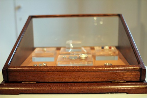
Bunney's table at the NEWGEN MEN and Fashion East Installations.

As previously discussed, jewellery line Bunney was launched after its creator was drawn to the idea of coming up with something everybody or anybody could wear...even nervous individuals like myself. Andrew Bunney longed to create objects that look like something one may be used to yet recast in a new light with precious metals, becoming new, yet at the same time, familiar. Ultimately, he wanted to make something precious that anybody could use. Over the course of a few seasons, he has been quietly navigating an elegant and refined men's jewellery offering that have grabbed my attention and left me experimenting. Seeking out the last bastions of British craftsmen and learning all about their trade. This season, I have had two opportunities to inspect the latest additions to the lineup including the beautifully crafted series of padlocks, a well defined lucky rabbit's foot and a Gallic makeover given to the studs. The Showroom Next Door provided the first opportunity and this was quickly followed by Bunney's addition to the exciting design talent showcase that made up NEWGEN MEN and Fashion East's Installations. Despite the hectic nature of Menswear Day, the latter afforded an opportunity to speak with the man himself and to learn more about his well crafted additions... 

Bunney's jewels on display


SS: Your offering has evolved from a single item to something of a magpie's haven. Could you talk us through the latest additions?
Andrew Bunney: I started Bunney with the simple idea to make something precious that anybody could use. This season I've investigated padlocks, charms and chains. I want to grow the line steadily, and try to keep coming up with something unique and exciting.


SS: The Padlocks were inspired by the practice of Love Padlocking in Paris and beyond. Where did you first encounter this practice? What was it about them that resonated with you?
Andrew Bunney: It was Paris where I first saw this idea. Talking to people these past few days at the showroom, I realise a lot of people that have seen these locks were excited to encounter it for the first time too. Instantly I was drawn by the spectacle - a huge array of padlocks, most bearing some kind of inscription, attached for the length of the bridge. Thinking about it later, the idea is really very special. Someone took this common, ordinary item, and by appropriation gives it a different purpose and meaning. I like how it has become a new kind of symbol for a lot of people. I also like personalisation, and the idea that someone would engrave the silver-lock with a message in a similar way to those attached to the bridge is very appealing to me. It speaks of a time when people used to personalise more of their possessions.


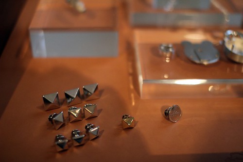
A closer look at the studs


SS: Now, I know that these items were a long time in the making. Could you tell us the story?
Andrew Bunney: For me, there are a few things which make jewellery quite different to clothing. Firstly it is the value in the materials used, secondly the longevity of the pieces - it isn't unusual for things to last for generations! Thirdly, the idea of the gift is very important.

I decided that it would be very special to create padlocks in precious metals, and I looked to see if anyone was making anything like that. It's quite common to find small charms, but never anything that really works as a lock with a key and mechanism. As I researched more about locks, I realised how important an object it was to the UK. Once upon a time, when Britain was growing an Empire, a small town outside of Wolverhampton called Willenhall was charged by Elizabeth the 1st to make locks. Yale, Squire, Chubb, all these companies that you see on your front door all came from this one town.

I started talking with a Museum to see if anyone was still handmaking locks, and I became really fascinated when I saw how traditional hand-made padlocks were put together. In some ways it looks very simple, which really added to the charm. Through a very long process I found what I believe to be the final locksmiths working, a father and son team, that can create an object like this although they had never tried anything as small or in these kind of metals.


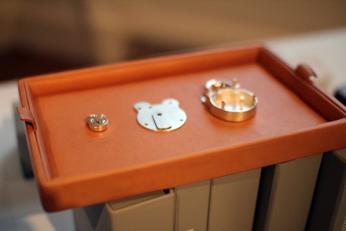
A closer look at the Old English Padlocks


SS: These certainly aren't your average padlock. Could you talk us through some of the processes?
Andrew Bunney: Once the sizes were decided, I had locks made to the specifications that I wanted. The locksmiths had to develop the internal workings, and when that was ready it went to one of the workshops that I use to work out how best to construct it in silver. The mechanism cannot be silver because of durability, but everything else is. The style is known as the 'Old English Padlock', and this is very much the traditional English shape.

SS: What has been the locksmiths reaction to your pieces?
Andrew Bunney: The Locksmith isn't a trade that receives a lot of attention, and they aren't normally making something known for beauty, so possibly bemusement at first! But as the work progressed they understood more and the attention was really appreciated. It's actually very remarkable to see what they can do on a day to day basis - opening locks that have long lost their keys and making replacements, restoration work for Buckingham Palace, very unique problem solving. Converting it to silver isn't straightforward, so again it took a lot of patience.


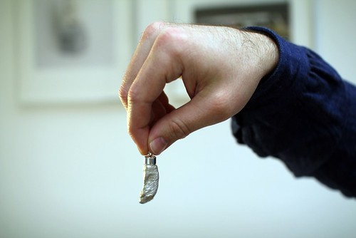
The beautifully carved paw. Yes, you've seen this image before but I love it so.


SS: Onto the lucky rabbit's foot. The detailing is remarkable. Firstly, what inspired this piece? Secondly, how did it evolve in to the stunning piece we see today?
Andrew Bunney: The Rabbit's foot is seen as lucky in many cultures, and for many years. Today I think it is known as a popular symbol or charm used by bikers - you can often see them with white ones, or sometimes dyed bright colours too. I see it as a natural fit or emblem for Bunney, something that anyone can wear.

I had wanted to make a chain with no clasp at the back of the neck so it could fit anybody, and I wanted to have charms that people could wear with it. I designed a chain that has clasps to hang items from, rather than to attach together. This time I have a small padlock and the Rabbit's Foot.

The paw or foot itself has been carved by an artist in London that specialises in making sculptures of animals, and so he worked from his studies and an original biker-style rabbits foot. The foot is cast silver, and a polished cap is added.

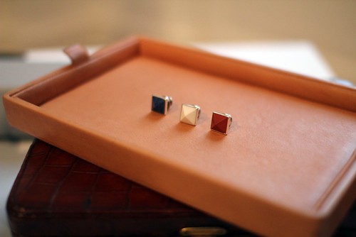
The Tricolor Flag studs

SS: This season the studs receive a decidedly French makeover...
Andrew Bunney: Because this season the theme came from the Paris Love Locks, I thought it would be nice to make studs to reflect the Tricolor Flag. These are made with stones and then set in a silver mount - it's an update from the styles I made for Soph/Uniform Experiment last year.

SS: Finally, what's next for Bunney?
Andrew Bunney: To make new things and expand gradually. There are a few things I'm thinking about, but you'll have to wait and see!
----------